I’ve been neglecting this blog, I once again plan to try and post something at once or twice a month. I’ve recently presented on a couple of topics for my local photography club and plan to look at converting those into blog posts at some point.
January Club Competition Entries
This is January’s competition entry into the EDI (Electronic Digital Image) section, the subject was “A Splash of Red” which is defined as
“A Splash of Red”
A scene in which a single item of red occupies a small but pictorially important part of the picture
The first image was taken outside the Pearl Harbor Aviation Museum, a 15 story, 168 feet tall Ford Island Control Tower. Edited using Lightroom to enhance the storminess of the sky and make the red pop. This was taken with a Nikon P900 cropped from landscape to portrait.
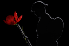
The second image is a perspex figure of a word war one soldier, I wrapped an artificial poppy around the rifle bayonet as a symbol of remembrance. The photo was taken in a light box with two external flashes to control the light so that the edges of the figure are bright and the poppy is highlighted.
The print section was Spiritual Sites which I didn’t enter.
February Club Competition Entries
Next is February’s competition, this time I entered the print section which was an open entry. The definition for open is:
“Open”
Any subject but it should contain one or more of the following qualities: Pictorial (composition), impact, appeal, story-telling or interest.
The first image is the Memorial Cross on Mount Macedon, I went up to see if I could get a decent sunrise shot from the lookout, but mis-judged the time and ended up taking what I think is a very warm photo of the memorial cross in the dawn light. I was using Nisi 100mm Filters to get a 5 second exposure. Some slight editing in Lightroom to slightly improve the warmth and colour vibrancy, cropping and removing some dust specs that were either on the lens, filter or sensor.
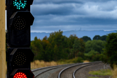
The second image is a railway signal light at Kyneton station, I intentionally softened the background through depth of focus to try and reduce the tracks from leading the eye away from the main subject, the signal light. I’m not sure it works perfectly, but I was happy with it. Some editing in Lightroom to boost the vibrancy and increase the contrast in the clouds.
The EDI section subject was Abandoned, the definition is:
“Abandoned”
Capture the beauty / story behind a abandoned building / place / object
Both of these images were taken in a vehicle graveyard, part of an old disused factory/manufacturing complex near Geelong that was being converted into an art space.
The first a row of two cars and two buses, I liked the angle, leading lines and alternating car bus car bus. The rust and general deterioration certainly fit the brief, and the vintage vehicles while old, abandoned and derelict still retain the beauty that you don’t often see in modern vehicles.
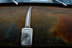
The second is a close up of the bonnet of a Fiat 1100, I love the rusty patina. This was an attempt at a more unusual composition, I intentionally left the top of the bonnet and part of the windscreen in the final crop to provide context that this was a car bonnet with Fiat logo, otherwise its just a logo on a rusty bit of metal.
March Club Competition Entries
These two subjects were a struggle for me, but part of learning in photography is to push comfort levels, expand your boundaries and try new things.
The print section subject was Landscape, the definition is:
“Landscapes”
A photograph of natural scenery with land and sky-based elements, displayed in a pictorial fashion. It ay include evidence of man, people, animals, even part of the sea provided that none of these additional elements dominate the photograph
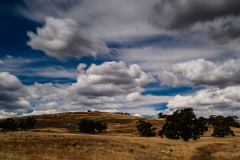
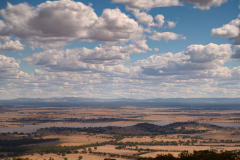
I haven’t had a lot of success with landscapes in the last couple of years so I needed to go out and try to find somewhere within driving distance that would provide some kind of interest. I drove from Bendigo towards Mount Tarrengower hoping to get a decent vista from the lookout tower. The first image I found an interesting scene on the way with nice looking clouds some rock formations on the hill so stopped and took a few photos with Nisi 100mm filters using both an ND and a graduating filter to try and get some long exposure and cloud blurring.
The second image is from the tower, there were a few controlled burn offs happening resulting in smoke along the horizon. I wanted to get something entered so this was about the best shot I was happy to submit, the clouds provide some interest, the water and contrast between the darker hills and the dry yellowed grass, but it really is a stretch. Hopefully I can find some better landscapes to get some better examples for future competitions.
The EDI section was Food Photography, the definition is:/
“Food Photography”
Food as the main subject for still images such as food promotion, cooking books, billboards, marketing etc.
Again I found that this was a hard subject to photograph. How do you make food look interesting, tell a story or be an interesting composition. I nearly gave up but did manage to get two reasonable images.
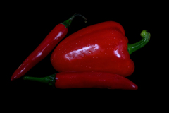
The first is a couple of chilis and a bell pepper/capsicum. I sprayed some water on them to provide some freshness and contrast. I learned during a flower photography class a few years ago that spraying water onto things like flowers or in this case vegetables adds to the image. The composition has some angles, triangles, but overall I don’t think it’s a great photo but meets the definition, it could probably have been brighter.
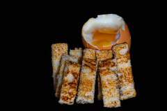
The second was an attempt at a bit of creativity, an egg with toast soldiers, maybe too many pieces of toast and unfortunately the shell of the egg cracked a bit too much. Maybe it would have been better with a large chunk of yolk on one of the bits of toast, and it is a little obvious that I managed to burn one side of the toast. The bits I like are the colour of the yolk, and the dark orange parts of the toast.
